In Kerameikos, Athens, a 107 m² fish restaurant draws on the Hindu myth of Manu, translating the idea of the ark, transition and protected growth into a space of sea-blue surfaces and wave-like light.
According to Hindu mythology, the wise and virtuous Manu was a figure of protection, care and rebirth. The story of the small fish that grew under his watch and revealed its true divine nature as Vishnu serves as the conceptual axis for both the branding and the interior design of MANU, a restaurant in Kerameikos designed by studiomateriality.
The design translates this myth into space through the notions of the ark, of transition and of carefully controlled evolution: from small to large, from the protected to the open.
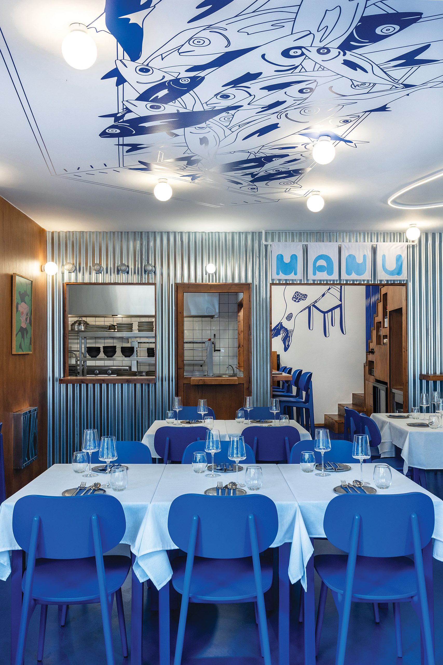
An open kitchen at the core
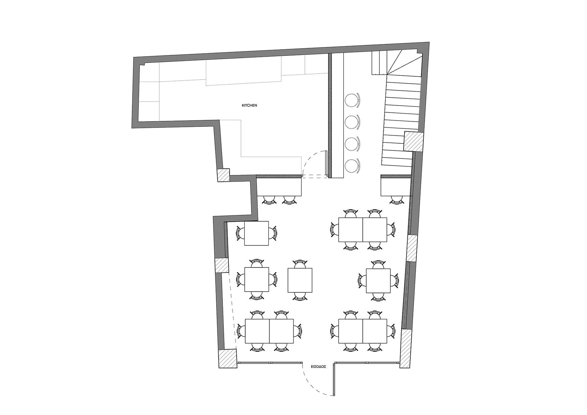
The 107 m² interior is therefore organised as a single, legible environment in which the open kitchen acts as the central core. The layout allows direct visual contact between the kitchen and the dining area, reinforcing a sense of transparency and of a handmade process.
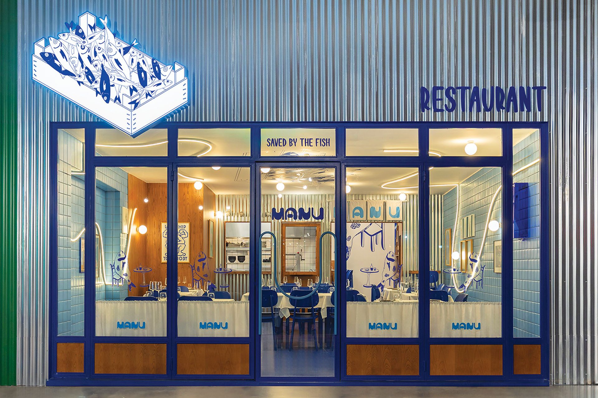
The kitchen is enclosed with corrugated metal sheets, a deliberate choice that refers both to makeshift street food structures and to industrial surfaces, lending the space a certain rawness and honesty.
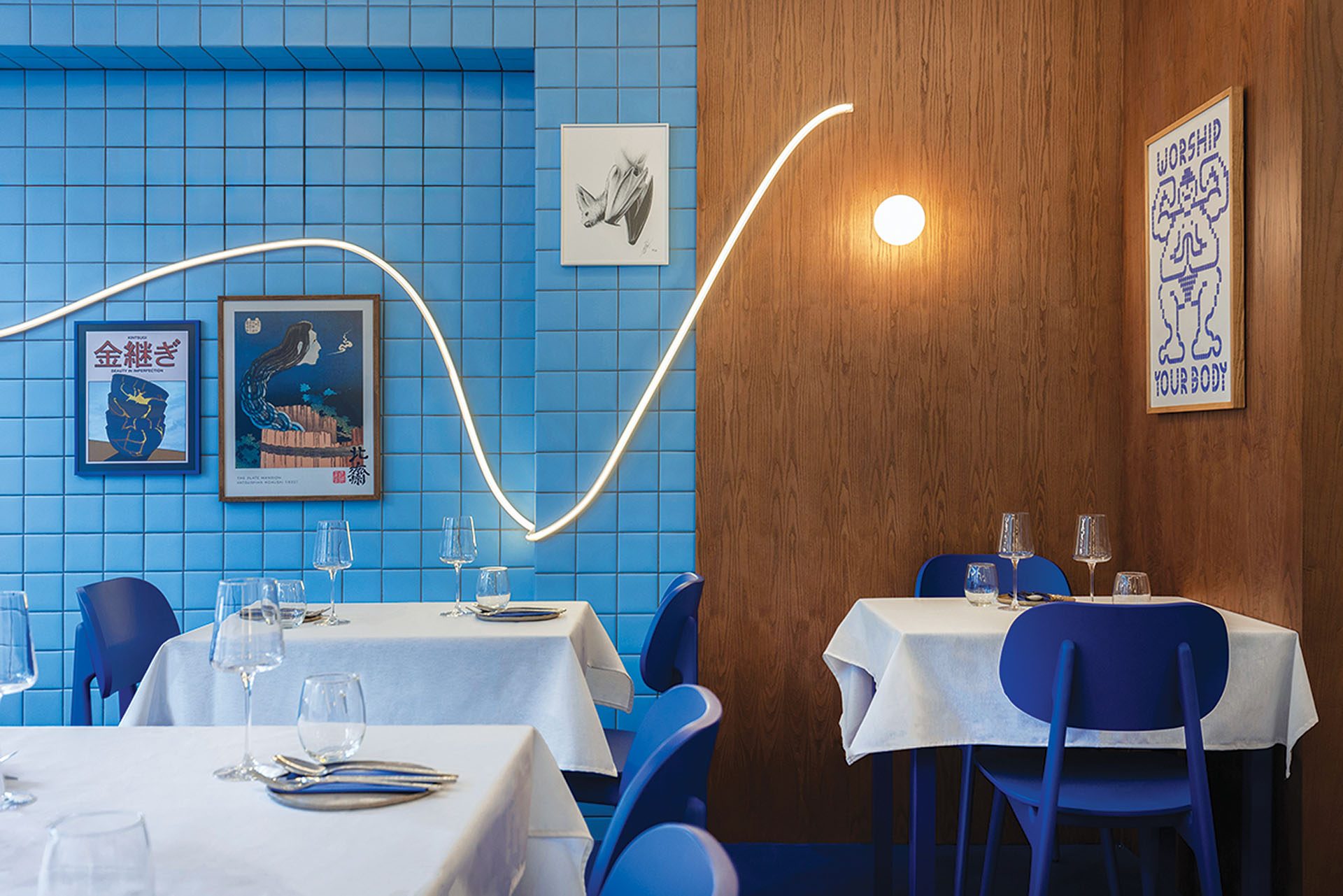
Sea, sky and the ark
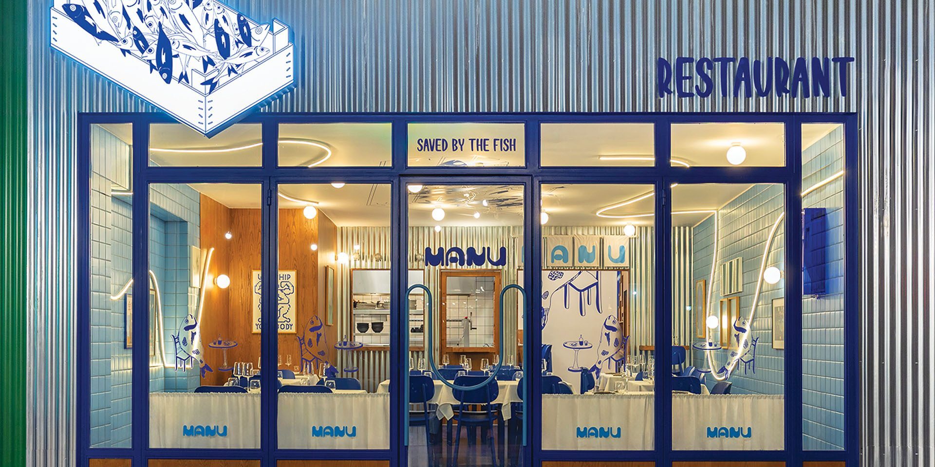
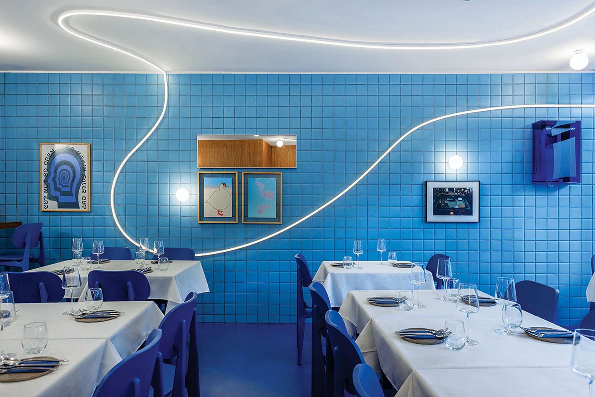
Materiality plays a decisive role in the overall experience. The deep blue floor works as a metaphor for the sea, while the wall tiles, in shades of sky blue, create a bright, clean backdrop.
Timber cladding on a main vertical plane refers in an abstract way to Manu’s ark, while also recalling the counters of traditional Japanese ramen bars, a cultural bridge between Greek and Japanese approaches to food.
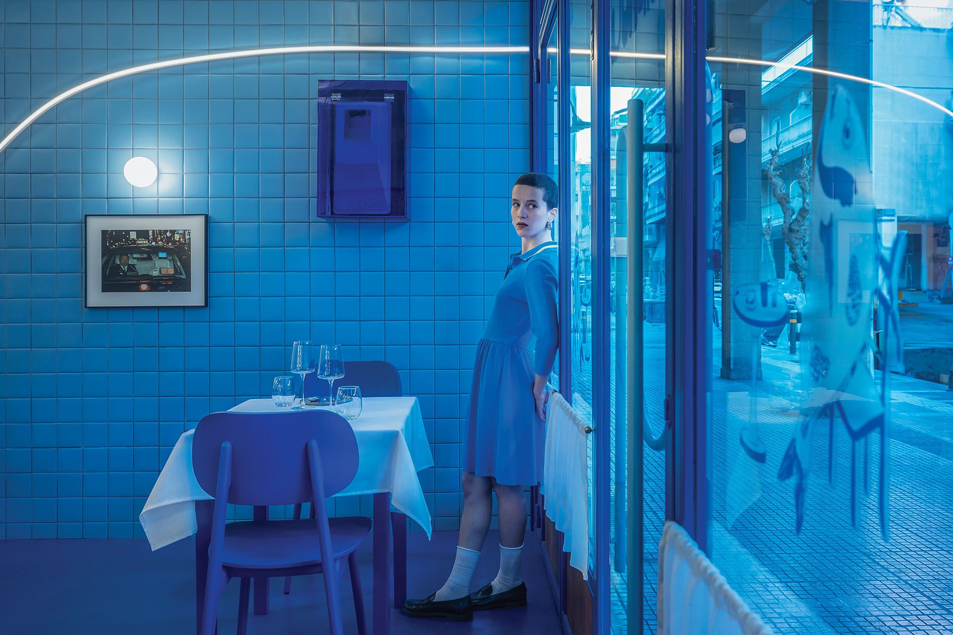
Waves of light
Lighting was conceived as an architectural element rather than a purely functional need. Curved light fixtures run across the walls and the ceiling, imitating the movement of waves and creating a sense of flow through the space.
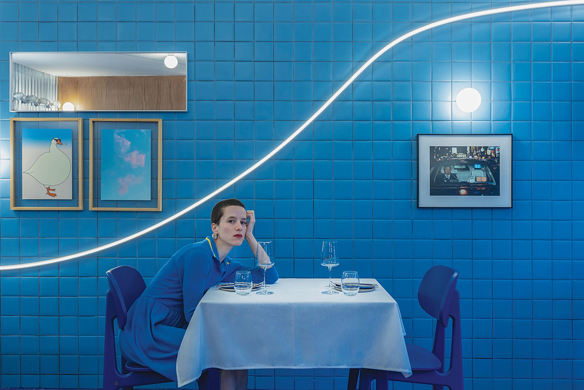
These fixtures frame the ceiling mural and converse with the sign on the façade, elements that could belong to a contemporary fishmonger’s. At MANU, however, they symbolise the freshness of the produce and the kitchen’s close relationship with the sea.
The project was first published in print in ek304 | January-February 2026.
https://ek-mag.com/wp-content/uploads/2026/11/15-web.jpg
https://ek-mag.com/wp-content/uploads/2026/11/03-web.jpg
https://ek-mag.com/wp-content/uploads/2026/11/01-web.jpg
https://ek-mag.com/wp-content/uploads/2026/11/09-web.jpg
https://ek-mag.com/wp-content/uploads/2026/11/11-web.jpg
https://ek-mag.com/wp-content/uploads/2026/11/12-web.jpg
https://ek-mag.com/wp-content/uploads/2026/11/MANU_floorplan-web.jpg
Related Posts