Double motion
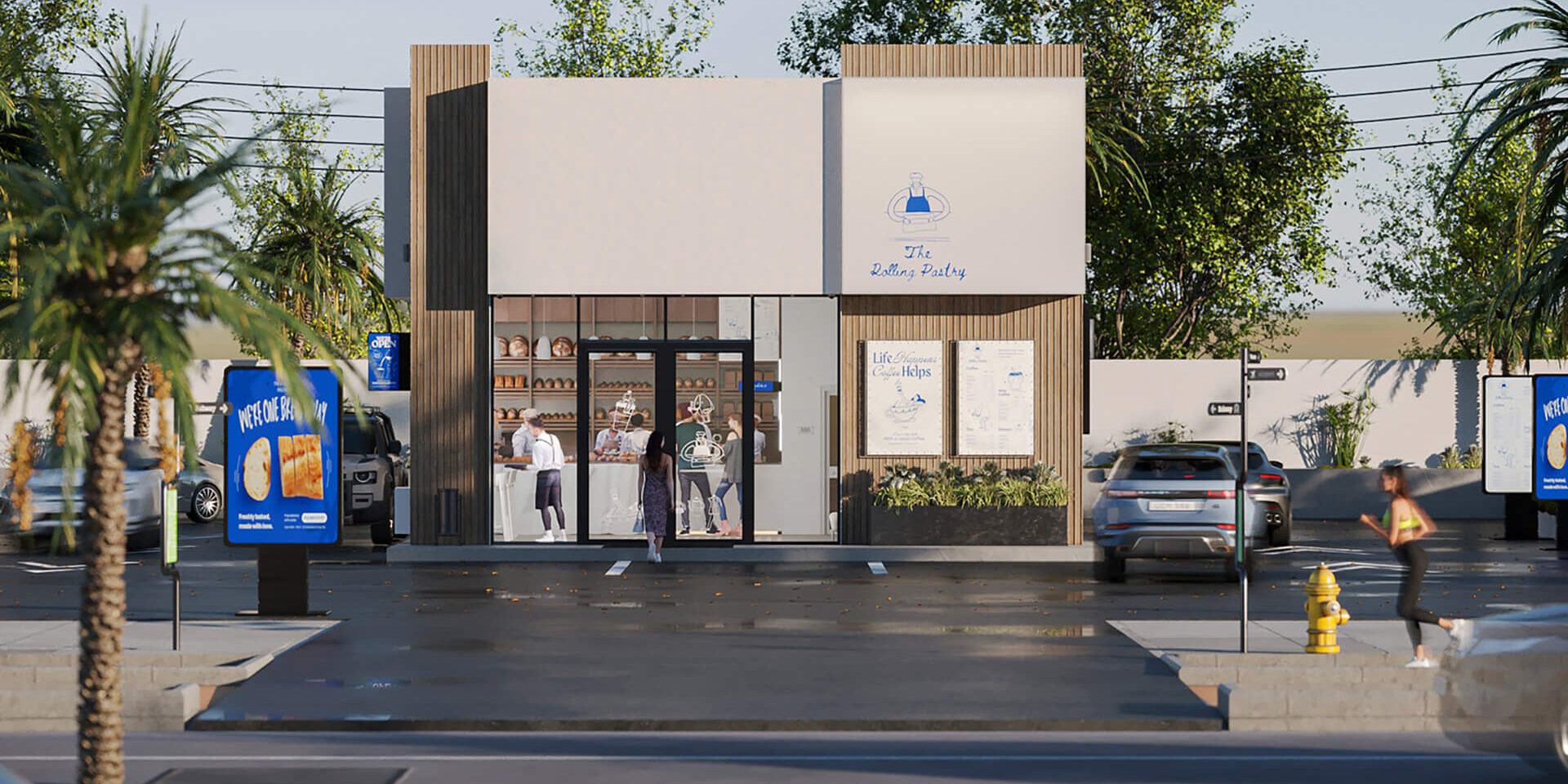
This unique drive-through café bakery concept redefines convenience for busy professionals, commuters, and anyone seeking a delicious break from their hectic day.
Design Philosophy
The project addresses the growing demand for a space that caters to both the fast-paced lifestyle of those constantly on the move and those looking for a quiet, relaxing moment amid their busy routines. The concept is simple: a drive-through café bakery that combines the speed of service with the comfort and warmth of fresh, high-quality baked goods. Every detail, from the clean lines of the architecture to the minimalistic yet inviting branding, was carefully designed to provide an enjoyable experience.
From the outset, the vision for the bakery extended beyond a single location. The brand was designed with franchising in mind, ensuring scalability while preserving its unique identity. The color palette, materials, and design choices reflect this focus, emphasizing elements that are easy to replicate yet leave a lasting impression. With consistent branding and thoughtful design, every new franchise location is poised to deliver the same welcoming, efficient experience that customers will recognize and love.

Materials & Color Palette
The branding, design, and service all reflect the café’s intentional flexibility, creating a dual-purpose concept that caters to both fast and slow consumption. Every design choice, from the colors to the materials, was carefully considered to craft an experience that is welcoming, efficient, and memorable. Blue was chosen as the primary color for its bold, vibrant, and timeless quality, representing clarity and freshness. This specific shade of blue also evokes trust and reliability, essential traits for a brand serving busy professionals and families on the go. Additionally, the blue contrasts beautifully with the golden hues of freshly baked goods, making the food visually stand out. Accents of white and grey were introduced to bring balance and sophistication to the brand. These neutral tones create a clean, minimalistic backdrop that allows the bright blue elements to pop while maintaining an approachable and elegant design. The simplicity of the color scheme ensures its success and scalability for future franchises, as it is both easy to reproduce and visually striking.
Choosing the right materials for future franchise locations was crucial, balancing durability, sustainability, and aesthetics. The facades are made from high-quality, weather-resistant materials to ensure longevity and minimal maintenance, making them easy to replicate across different sites. Materials like polished concrete, lightweight metals, and treated wood accents were selected for their modern functionality. Concrete provides durability and stability, while metal elements add a contemporary edge. Weather-treated wood accents bring warmth and comfort, reinforcing the bakery’s image as a welcoming space.

Functional Organization
The architecture is streamlined and modern, designed for quick service to accommodate fast-paced customers. Wide, easy-to-navigate lanes, clear signage, and strategically placed ordering points ensure a smooth and efficient drive-through experience. At the same time, the exterior design offers an inviting atmosphere for those who wish to stop, grab a coffee, and enjoy the freshly baked goods. The storefront’s minimalistic structure, paired with clean lines, ensures the space remains open and welcoming. The simple yet sophisticated design reflects the ease and quality that the brand promises. Every detail was chosen to minimize wait times and maximize the customer experience.

